Icons are perhaps the most overused and understated elements of e-learning design. In fact as e-learning designers, we are so used to seeing them that we might sometime forget their purpose and significance.
Icons styles can be flat, line, color filled or no matter what, their primary objectives in e-learning are
- Providing visual cues to learners as to what content is likely to follow.
- Increasing the comprehension and retention of the learners as icons follow universally accepted styles and designs.
- Grabbing attention on a particular point on a text-heavy slide like a summary or important tip or clue or a policy matter etc., which finally leads to improved retention.
- Clustering information together to provide a memory map to the learners.
The right icons can dramatically increase comprehension, making it easier to communicate ideas effectively and in a shorter time.
Now let us look at the various types and styles of icons:
There are primarily 4 types of Icons :
| Sl.No | Icon Type | Description | Example | Image |
| 1 | Resemblance Icons | That resemble the real-life objects. | Recycle Bin | 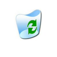 |
| 2 | Exemplar Icons | Communicate meaning but not as directly as resemblance icons. |
Traffic Symbol | 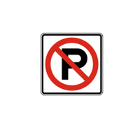 |
| 3 | Symbolic Icons | These create analogies and communicate concepts. | Locking Doors | 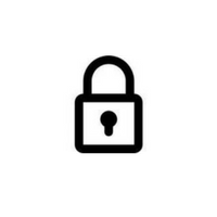 |
| 4 | Arbitrary Icons | Communicate meaning by use of specific conventions. | Radioactive hazard symbols | 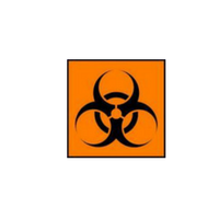 |
Let’s take a look at different Icon Styles :
| Sl.No. | Icon Style Icon | Description | Image |
| 1 | Outline Icon Style | Outline icons are clean, modern and most commonly designed in monochromatic fashion with thin, smooth strokes. It is also called as Lined icons. | 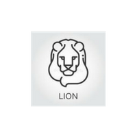 |
| 2 | Colored Icon Style | colored icons are also called as filled outlines, are the colored counterpart of outline icons. | 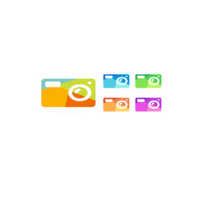 |
| 3 | Flat Icons | They are the colored counterpart of glyph icons and known for their subtle use of highlight and shadow. | 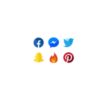 |
| 4 | Doodle Icon Style | Doodle are hand drawn sketches. This icon style is organic, approachable and sure to lighten up a boring design. | 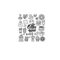 |
| 5 | Animated GIF Icon Style | Animated icons which are usually in GIF format. It looks fresh when an animation is looped and it can be used in fun creative ways. | 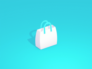 |
| 6 | Line Icons | They are extremely minimalist and thus quick to download. Objects and symbols drawn as line icons are easy to identify because of the simplicity. They are ideal for navigation and buttons. | 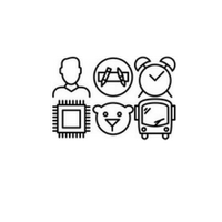 |
| 7 | Filled icons | They are similar to line icons and fills the missing details in the mind of the viewer. Filled icons are more conspicuous. |  |
| 8 | Detailed Icons | They are the most realistic of visual format. They are small illustrations that provide more detail than the icon styles with more color, shading, lines or shadows. | 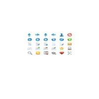 |
| 9 | Folded corner icons | They have a small fold in upper or lower corner that adds a third dimension to their look. They appear to be a slightly peeling sticker thus adding a touch of personality to the icon. |  |
| 10 | Two-tone icon style | It is also known as dual-tone. Two-tone icons are usually a variant of colored icons but with a limited two-color palette. | 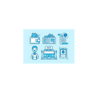 |
| 11 | Material Icon Style | It uses geometric shapes to visually represent core ideas, capabilities or topics. It is clean and simple. |  |
While my effort was to put together a comprehensive list of types and styles of icons their usage is driven by the learning needs, design specifications and the overall learner experience.